## A Set of Books: Exploring the Design of *Dark Beige_1*
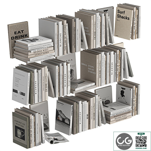
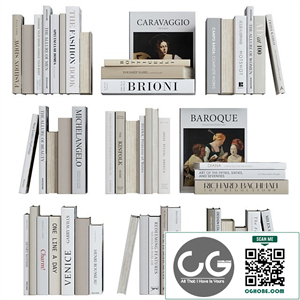
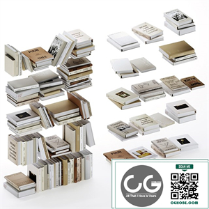
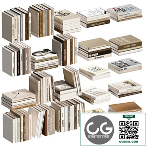
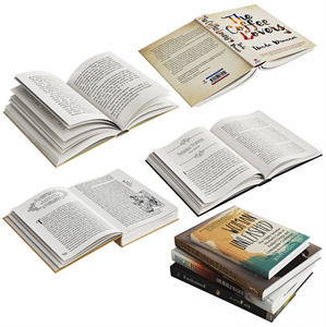
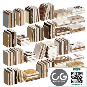
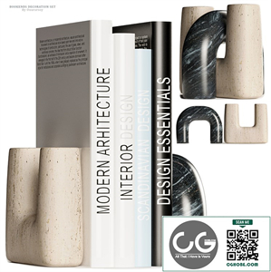
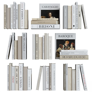
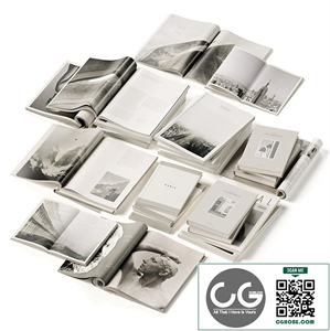
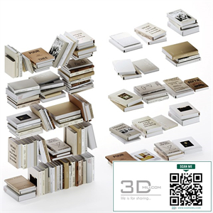
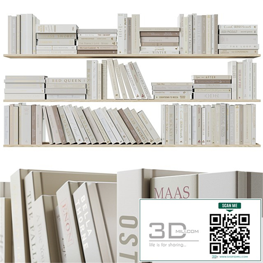
This design, titled "A Set of Books: Dark Beige_1," transcends a simple depiction of stacked volumes. It's a study in texture, light, and the evocative power of simplicity. The seemingly unassuming palette of *dark beige* belies a depth that rewards close examination, inviting the viewer to consider the untold stories held within its implied narratives. This exploration will dissect the various elements of the design, from the technical aspects of its creation to its potential interpretations and emotional resonance.
Part 1: The Palette – A Study in *Dark Beige*
The *dark beige* chosen for this design is far from bland. It's a sophisticated hue, far removed from the clinical sterility of a true off-white. This particular shade possesses a richness, a warmth, suggesting aged paper, worn leather, and the subtle patina of time. It speaks of history, of stories whispered across generations, of accumulated knowledge and forgotten secrets. The absence of vibrant color enhances this effect. The monochromatic approach forces the viewer to focus on the *texture*, the subtle variations in tone and shading that give the illusion of depth and form. It's a testament to the power of restraint in design, proving that less can indeed be more. The lack of contrasting colors also allows for a sense of *unity* and *cohesion*, emphasizing the books as a single, unified entity rather than individual objects. The specific shade of *dark beige* employed is critical; a slightly lighter or darker tone could significantly alter the mood and overall feeling of the piece. The choice reflects a thoughtful deliberation on the intended atmosphere and the emotional response the artist seeks to evoke.
Part 2: Texture and Form – *Implied Depth and Tactility*
While the design is essentially two-dimensional, it successfully creates the illusion of three-dimensional *form*. This is achieved primarily through masterful manipulation of *texture*. The subtle variations in shading simulate the uneven surfaces of real books, the slight depressions and raised edges created by the binding and the individual pages. The artist cleverly uses *light and shadow* to suggest the curvature of the spines and the depth of the stack. There’s an implied weight to the books; they feel substantial, weighty, even perhaps a little dusty. This sense of *tactility* is crucial to the design's success. It's not just a visual representation of books; it’s a representation that engages the viewer’s sense of touch, encouraging them to imagine the feel of the aged paper, the worn leather, the smooth, slightly cool surface of the spines. This *tactile engagement* is key to understanding the emotional impact of the design. The viewer isn't simply looking at a picture; they’re experiencing a *sensory engagement* with the implied object.
Part 3: Composition and Arrangement – *Balance and Narrative*
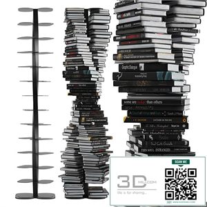
The *composition* of "A Set of Books: Dark Beige_1" is meticulously considered. The books are arranged not in a haphazard pile, but with a subtle sense of *balance* and deliberate placement. The slightly off-center stacking creates a sense of casualness, suggesting a collection casually placed rather than meticulously arranged. This seemingly accidental arrangement, however, contributes to the overall feeling of *authenticity* and *lived experience*. It's not a staged, overly-perfect image; it’s a portrayal that speaks to the everyday, the lived reality of accumulated knowledge and personal histories. The *arrangement* also hints at a potential *narrative*. The slightly uneven stack suggests a collection that has been built up over time, each book representing a different chapter, a different story, a different journey. The subtle imperfections tell a story of their own, a story of use and time.
Part 4: Light and Shadow – *Creating Depth and Mood*
The play of *light and shadow* is essential to the design's success. The subtle gradations of *dark beige*, enhanced by the strategic use of shading, create a strong sense of *depth*. The light appears to be softly diffused, avoiding harsh contrasts that might detract from the sense of quiet intimacy the design cultivates. This soft lighting emphasizes the textures, allowing the subtle variations in tone to create the illusion of three-dimensionality. The lack of strong highlights or shadows reinforces the overall sense of *calmness* and *serenity*. The mood is contemplative, inviting the viewer to slow down, to appreciate the details, and to reflect on the stories that might be contained within those implied volumes. The light itself becomes a subtle character in the design, subtly shaping the mood and enhancing the atmosphere.
Part 5: Interpretation and Emotional Response – *Beyond the Visual*
"A Set of Books: Dark Beige_1" is more than just an aesthetically pleasing image; it’s an invitation to reflection. Its *emotional resonance* lies in its ability to evoke a sense of *nostalgia*, *comfort*, and a quiet contemplation of the past. The *dark beige* palette, the implied textures, the subtle composition – all work together to create a feeling of warmth and familiarity. The viewer might be reminded of a favorite childhood book, a cherished collection, or the comforting presence of a well-loved library. The design taps into our collective memories and experiences associated with books, creating a deeply personal and evocative experience. The absence of any overtly symbolic elements allows for a broad range of individual interpretations, making the design accessible and relatable to a wide audience. It’s a design that speaks to the universal human experience of connection to stories and the tangible objects that hold them. This *openness to interpretation* adds to its enduring appeal and contributes to its lasting impact.
Conclusion:
"A Set of Books: Dark Beige_1" is a powerful example of how simplicity can achieve profound visual and emotional impact. Through careful consideration of *palette*, *texture*, *composition*, and *lighting*, the artist has created a design that transcends its subject matter, becoming a meditation on time, memory, and the enduring power of stories. It's a testament to the potential of minimalist design to evoke deep emotional responses and invite thoughtful engagement from the viewer. The seemingly simple act of representing a stack of books becomes a nuanced exploration of visual storytelling, demonstrating that even the most commonplace objects can possess extraordinary visual and emotional depth when approached with artistic sensitivity and a keen eye for detail.