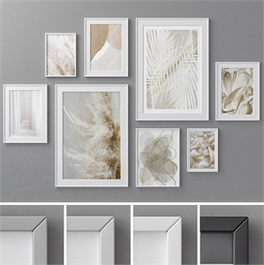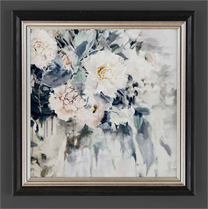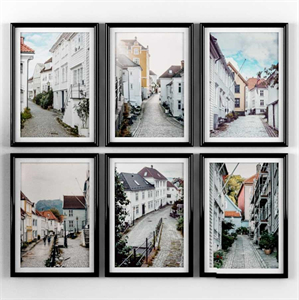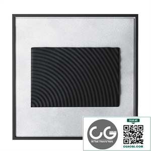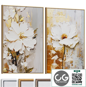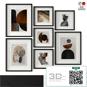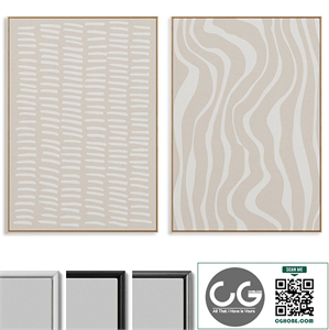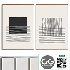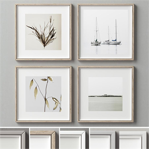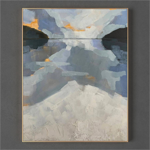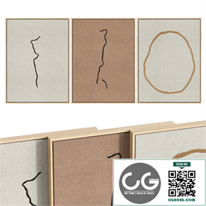
## Plaster Posters 01: A Deep Dive into the Design
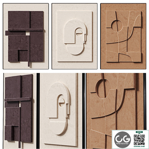
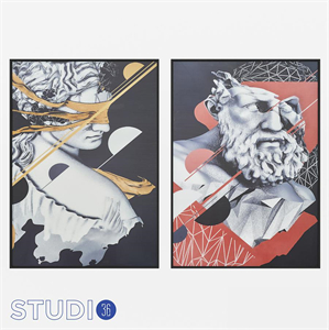
Plaster Posters 01 isn't just a collection of posters; it's an *exploration* of texture, *materiality*, and the unexpected beauty of *everyday objects*. This design project seeks to challenge conventional notions of poster design by moving beyond the digital realm and embracing the tactile richness of *plaster*. By utilizing this often-overlooked material, we aim to create a series of works that are simultaneously visually striking and deeply engaging to the touch. This document will delve into the conceptual underpinnings, the material processes, and the design decisions that shaped Plaster Posters 01.
### Part 1: Conceptual Framework – The Unexpected Beauty of the Mundane
The core concept driving Plaster Posters 01 revolves around the idea of *elevating the ordinary*. We often overlook the *subtle beauty* inherent in everyday materials and objects. Plaster, a material typically associated with construction and utilitarian applications, embodies this unnoticed potential. Its rough, imperfect texture, its capacity to hold and reflect light in unique ways, and its inherent *earthiness* offer a stark contrast to the sleek, polished aesthetic often favored in contemporary poster design.
This project is a deliberate attempt to *recontextualize* plaster. By transforming it into a medium for artistic expression, we aim to draw attention to its intrinsic qualities and highlight its potential for aesthetic exploration. Instead of attempting to *mask* its inherent imperfections, we embrace them, letting them contribute to the overall character and uniqueness of each poster. The *imperfections* become integral elements of the design, reflecting the handcrafted nature of the process and adding to the overall *authenticity* of the final product.
Our aim wasn't to create flawless, digitally-perfect reproductions. Instead, we aimed for a level of *organic imperfection* that speaks to the handmade nature of the work, creating a unique and *tangible connection* between the artwork and the viewer. The *imperfections* are not flaws but rather characteristics that add depth and character to the final piece. The tactile experience, the feeling of the rough plaster beneath one’s fingertips, becomes an essential component of the artistic experience, enriching the visual impact.
### Part 2: Material Exploration – The Alchemy of Plaster
The choice of *plaster* as the primary material wasn't arbitrary. Its malleability, its capacity to hold detail, and its ability to be molded and shaped into diverse forms made it an ideal medium for this project. However, working with plaster presented its own set of challenges. The process demanded careful planning, precise execution, and a deep understanding of the material's properties.
The creation of each plaster poster involved a multi-stage process:
1. Mold Creation: Initially, we had to create *precise molds* to ensure consistency and repeatability in the process. These molds were meticulously crafted, taking into account the desired texture and form of the final poster. Different materials were experimented with – silicone, plaster itself, and even repurposed containers – to find the optimum solution for producing clean and detailed casts.
2. Plaster Mixing and Pouring: The *mixing of the plaster* was a critical step, requiring a specific ratio of plaster to water to achieve the desired consistency. Too much water resulted in a weak, brittle cast; too little resulted in a difficult-to-pour mixture. The *pouring process* itself had to be done carefully to avoid air bubbles and ensure an even distribution of the material within the mold.
3. Curing and Finishing: Once poured, the plaster needed sufficient *time to cure*. This process allowed the plaster to harden and gain strength. After curing, the posters were carefully removed from the molds, revealing the intricate details captured in the original design. The *finishing process* involved gentle sanding to smooth out any rough edges and enhance the overall texture, yet still preserving the characteristic *roughness* of the plaster.
4. Color and Texture: The *color palette* for Plaster Posters 01 was carefully considered, aiming for a balance between earthy tones and pops of brighter hues. *Pigments* were added to the plaster mix before pouring, allowing the color to permeate the material itself, giving the posters a depth and richness not possible with surface treatments. Experiments with various textural elements were also implemented, some posters incorporating subtle embedded elements to further enhance the tactile experience.
### Part 3: Design Decisions – Form, Function, and Texture
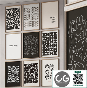
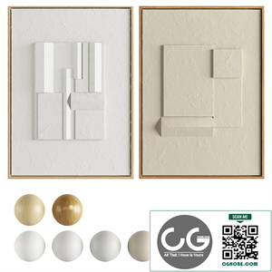
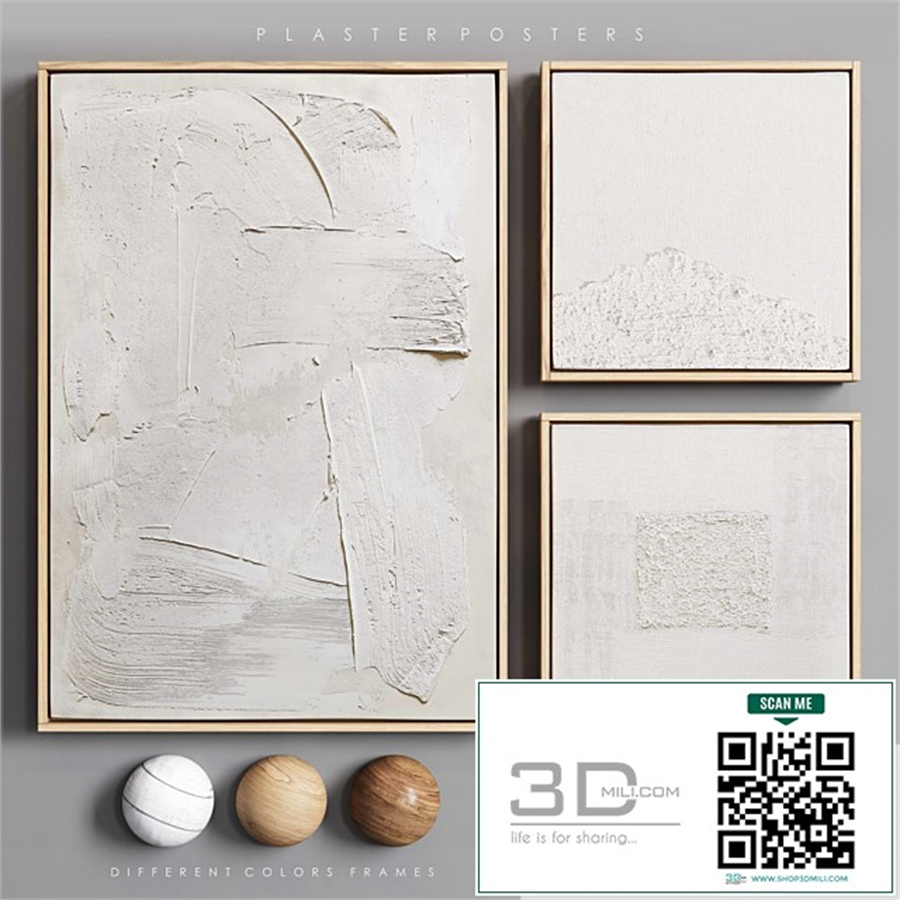
The *design aesthetic* of Plaster Posters 01 is characterized by a deliberate simplicity. We sought to avoid overwhelming the viewer with excessive detail or ornamentation. The focus was on creating a strong visual impact through the strategic use of *form, texture, and color*. Each poster features a simple, yet evocative, design, allowing the *materiality of the plaster* to take center stage.
The *typography* used was carefully selected to complement the rustic, handcrafted nature of the posters. We chose fonts that possessed a certain *weight and solidity*, mirroring the substantial nature of the plaster itself. The *text* itself served primarily as a complement to the visual element, adding context and meaning without distracting from the overall aesthetic.
The *size and scale* of the posters were also carefully considered. We aimed for a format that was both impactful and manageable, allowing for easy display and interaction. The tactile nature of the posters encourages a close examination, enabling the viewer to appreciate the *subtle nuances* of the texture and the details embedded within the plaster itself.
### Part 4: Conclusion – Beyond the Visual: A Tactile Experience
Plaster Posters 01 is more than just a collection of visually appealing posters. It's an *experiment* in materiality, a testament to the untapped potential of unconventional materials in artistic expression. The project explores the *intersection of art and craft*, challenging the viewer to engage with art on a deeper, more *sensory level*.
By prioritizing the *tactile experience*, we sought to create a connection between the artwork and the viewer that extends beyond the purely visual. The rough texture, the subtle imperfections, and the inherent *weight* of the plaster create a visceral engagement that enriches the artistic experience.
This project serves as a reminder that the *beauty of art* doesn't lie solely in its visual appeal but also in its ability to evoke sensory responses and create a lasting emotional impact. The inherent *imperfections* of Plaster Posters 01 are not flaws but rather hallmarks of its unique process, signifying the human hand behind its creation and adding to its overall character. Ultimately, Plaster Posters 01 strives to challenge our perception of what a poster can be and to offer a new perspective on the potential of *unexpected materials* in the world of artistic expression. The exploration of *plaster* as a medium opens doors to countless further possibilities in design and art. The future holds further investigations into the potential of this unique and often-underutilized material.